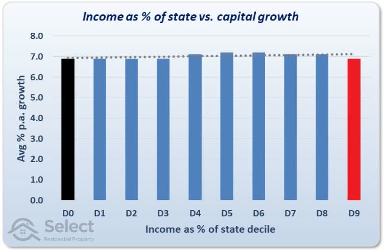
There’s a significant amount of historical evidence to suggest that wage growth isn’t the big driver of capital growth that investors have assumed for so many decades. At the suburb level, it simply doesn’t correlate to capital growth as the following chart shows…
The left black bar represents the per annum growth rate of suburbs with the lowest income relative to their state average. The right red bar is the highest.
There are more charts like this in the full article: “No need to find high wage growth suburbs”
This topic was modified 5 years, 2 months ago by Jeremy Sheppard.
This topic was modified 5 years, 1 month ago by Benny. Reason: remove link